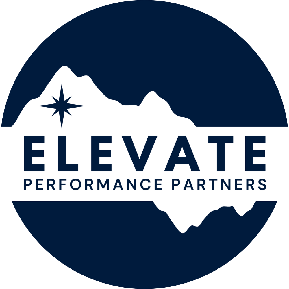

Brand Identity.
Brand Identity.
The visual system that maintains clarity, cohesion, and composure across all Elevate materials.
Design decisions should reinforce structure, not decoration.
COLOR SYSTEM
Color Philosophy
The Elevate Performance Partners color system is built around depth, clarity, and composure.
Deep Ocean serves as the foundation: a color associated with intelligence, stability, and cognitive control. Dark blues signal trust and authority while also creating a sense of internal steadiness. It reflects the psychological depth required for sustained high performance.
Gray Yellow introduces focused energy and forward orientation. Unlike bright yellow, this muted gold carries intention rather than urgency. It represents clarity of direction, optimism grounded in strategy, and momentum guided by thoughtfulness.
Light Blue and Gray Blue provide balance. These tones soften the system without diminishing strength, reinforcing perspective, emotional regulation, and measured decision-making.
Pure White functions as structural space within the brand. It allows for clarity, precision, and visual breathing room. Reinforcing the idea that high performance is not noise, but controlled execution.
Together, the palette communicates strength without aggression, authority without rigidity, and momentum without chaos, a visual system designed to reflect thoughtful performance at the highest level.
DEEP OCEAN
Hex: #001B3D
Rgb: 0, 27, 61
CMYK: 100,56,0,76
LIGHT BLUE
Hex: #e8eaee
Rgb: 232,234,238
CMYK: 3,2,0,7
GRAY YELLOW
Hex: #d4af37
Rgb: 212,175,55
CMYK: 0,17,74,17
GRAY BLUE
Hex: #6b7c8f
Rgb: 107,124,143
CMYK: 25,13,0,4
PURE WHITE
Hex: #FFFFFF
Rgb: 255,255,255
CMYK: 0,0,0,0
TYPOGRAPHY
Elevate Performance Partners uses League Spartan and DM Sans consistently across the logo, website, and all brand materials to create a clear and cohesive visual identity. Both typefaces appear in the logo and throughout the site to maintain continuity and recognition. League Spartan and DM Sans Bold are used for headers to create structure, hierarchy, and presence, while DM Sans Bold and Regular support subheadings and body copy for readability and balance. The system is intentionally simple, consistent, and strong headlines paired with clean, highly legible body text. Designers should prioritize clarity, clear hierarchy, and generous spacing to ensure content feels organized, confident, and easy to navigate across digital and print environments.
Aa
Primary Typeface (For Headlines)
League Spartan
ABCDEFGHIJKLMNOPQRSTUVWXYZ
abcdefghijklmnopqrstuvwxyz
1234567890!@#$%^&*()
Aa
Secondary Typeface Bold (For H2 & Body Text)
DM SANS
ABCDEFGHIJKLMNOPQRSTUVWXYZ
abcdefghijklmnopqrstuvwxyz
1234567890!@#$%^&*()
Aa
Secondary Typeface (For H2 & Body Text)
DM SANS
ABCDEFGHIJKLMNOPQRSTUVWXYZ
abcdefghijklmnopqrstuvwxyz
1234567890!@#$%^&*()